"You'll never soar like an eagle if you hang out with turkeys"
-Overheard from the streets of Bay Ridge
Role: User Research, Information Architecture, Visual Design, Animation, Illustration
Industry: Biotechnology
Duration: 9 weeks
Role: User Research, Information Architecture, Visual Design, Animation, Illustration
Industry: Biotechnology
Duration: 9 weeks
Role: User Research, Information Architecture, Visual Design, Animation, Illustration
Industry: Biotechnology
Duration: 9 weeks
Role: User Research, Information Architecture, Visual Design, Animation, Illustration
Industry: Biotechnology
Duration: 9 weeks
Role: User Research, Information Architecture, Visual Design, Animation, Illustration
Industry: Biotechnology
Duration: 9 weeks
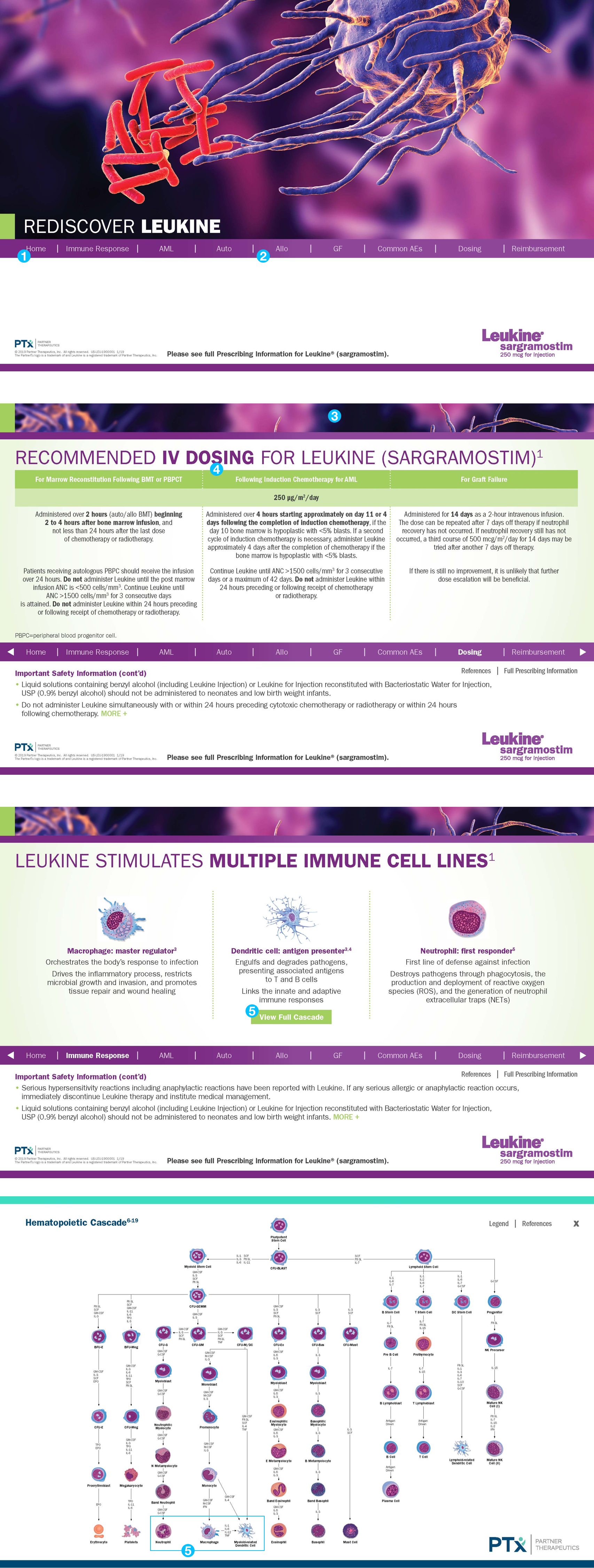
Sales Reps needed a tool to communicate the urgency in using Leukine (sargramostim) to treat and reduce the risk of infection in chemotherapy and radiotherapy patients.
Sales Reps needed a tool to communicate the urgency in using Leukine (sargramostim) to treat and reduce the risk of infection in chemotherapy and radiotherapy patients.
Sales Reps needed a tool to communicate the urgency in using Leukine (sargramostim) to treat and reduce the risk of infection in chemotherapy and radiotherapy patients.
Sales Reps needed a tool to communicate the urgency in using Leukine (sargramostim) to treat and reduce the risk of infection in chemotherapy and radiotherapy patients.
Sales Reps needed a tool to communicate the urgency in using Leukine (sargramostim) to treat and reduce the risk of infection in chemotherapy and radiotherapy patients.
To create a more useable solution we set up a meeting with the reps and discussed:
To create a more useable solution we set up a meeting with the reps and discussed:
Some of our key findings where:
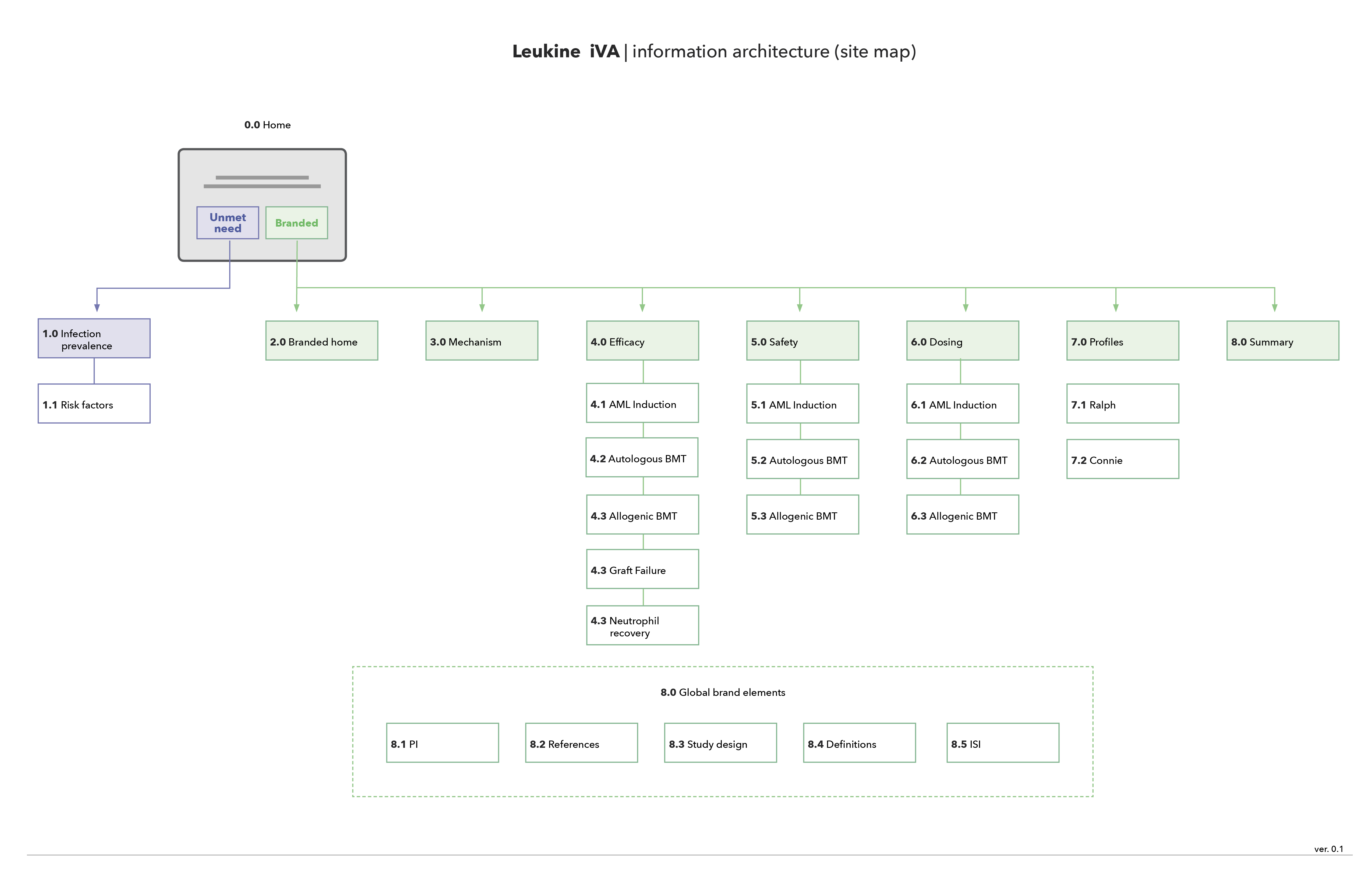
After conducting interviews with our sales reps, the main users of the tool, we identified a need to quickly navigate between 'Disease Education' and "Leukine Brand Story'. By separating the story into these streams we then focused on a taxonomy that was both descriptive and intuitive.
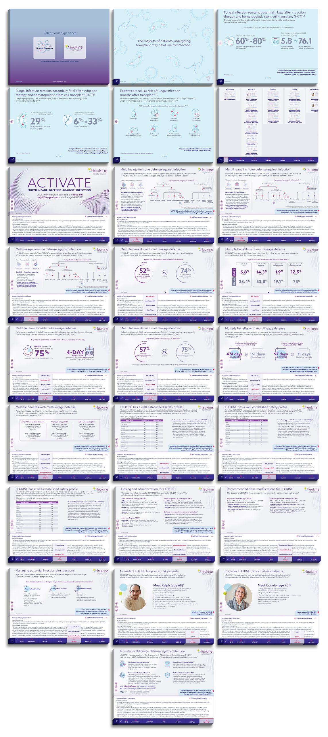
After identifying our users' needs and identifying areas for improvement we entered the design phase. After an initial discovery phase that consisted of sketches, we created wireframes.
Some key findings where:
After identifying our users' needs and identifying areas for improvement we entered the design phase. After an initial discovery phase that consisted of sketches, we created wireframes.
Some key findings where:
Selected Works
LUXTURNA MLMT VRUX/UI
Game of ThronesDesign
C5 Exhaustion HotelDesign
Neffy BrandingBranding
Athymia AnswersBranding
Atomic Sound BrandingBranding
The WaverlyBranding
DDB Health Holiday CardDesign
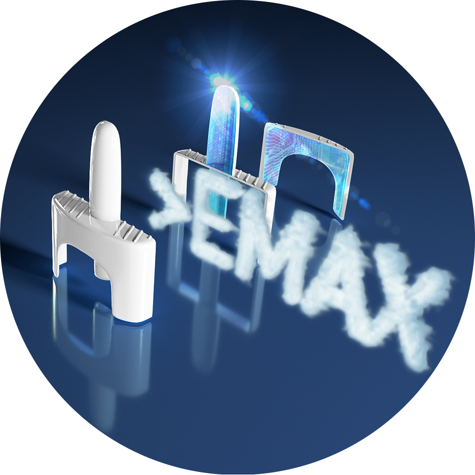
ARS Creative PositioningDesign
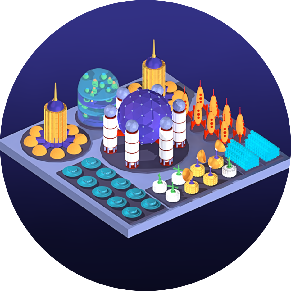
Isometric Space StationDesign

VHL Disease SiteDesign
LUXTURNA HCP SiteUX/UI
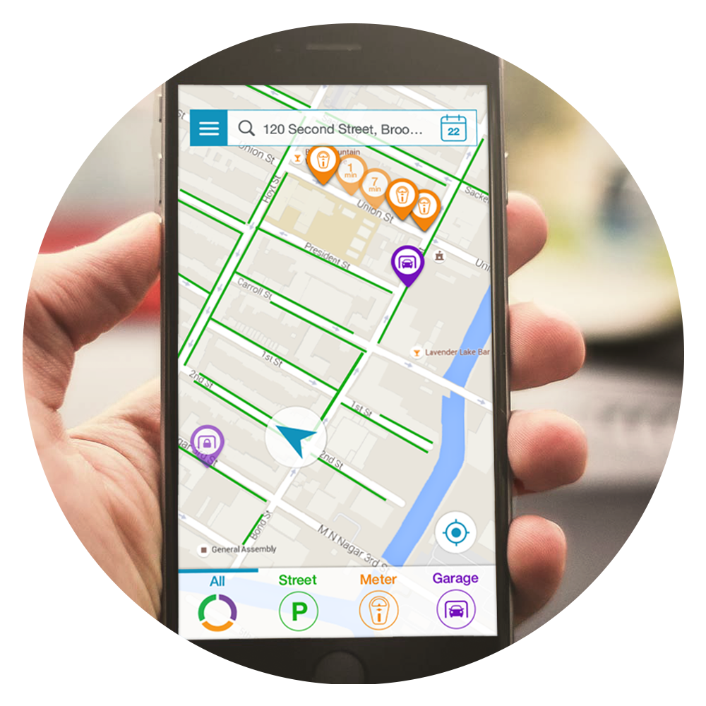
CurbyUX/UI

Chase Mobile BankingUX/UI
"You'll never soar like an eagle if you hang out with turkeys"
-Overheard from the streets of Bay Ridge
© RPTR 2021 | REPDESIGN LLC